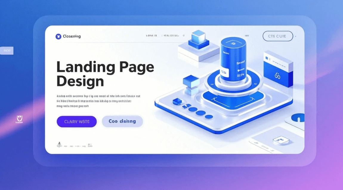
What is a landing page?
Source: venngage
A landing page is a standalone web page that is specifically for marketing or advertising campaigns. It is where a visitor ‘’lands’’ after clicking on a link from an email, Google, social media platforms, or other digital location. It is different from a homepage that is actually a gateway to your website.
A landing page is hyper-focused on a single purpose and a single call to action. It targets a specific audience to capture leads, advertise products, and encourage a purchase. Every element on a landing page, from CTA to images, drives users to take that desired action. Designing an impactful landing page is critical to turning visitors into leads and boosting conversions.
What is the significance of a landing page in digital marketing?
In digital marketing, a landing page serves as an interface between your marketing efforts and business goals. Having focus on a certain goal, they remove distractions and guide users towards taking action. An optimized landing page translates your ad spent into measurable results like leads or sales. According to HubSpot, companies that increase their landing page numbers from 10 to 15, see a 55% increase in leads. This shows why designing effective landing pages is necessary to get more impressions and conversions in digital marketing.
The Importance of Landing Page Design
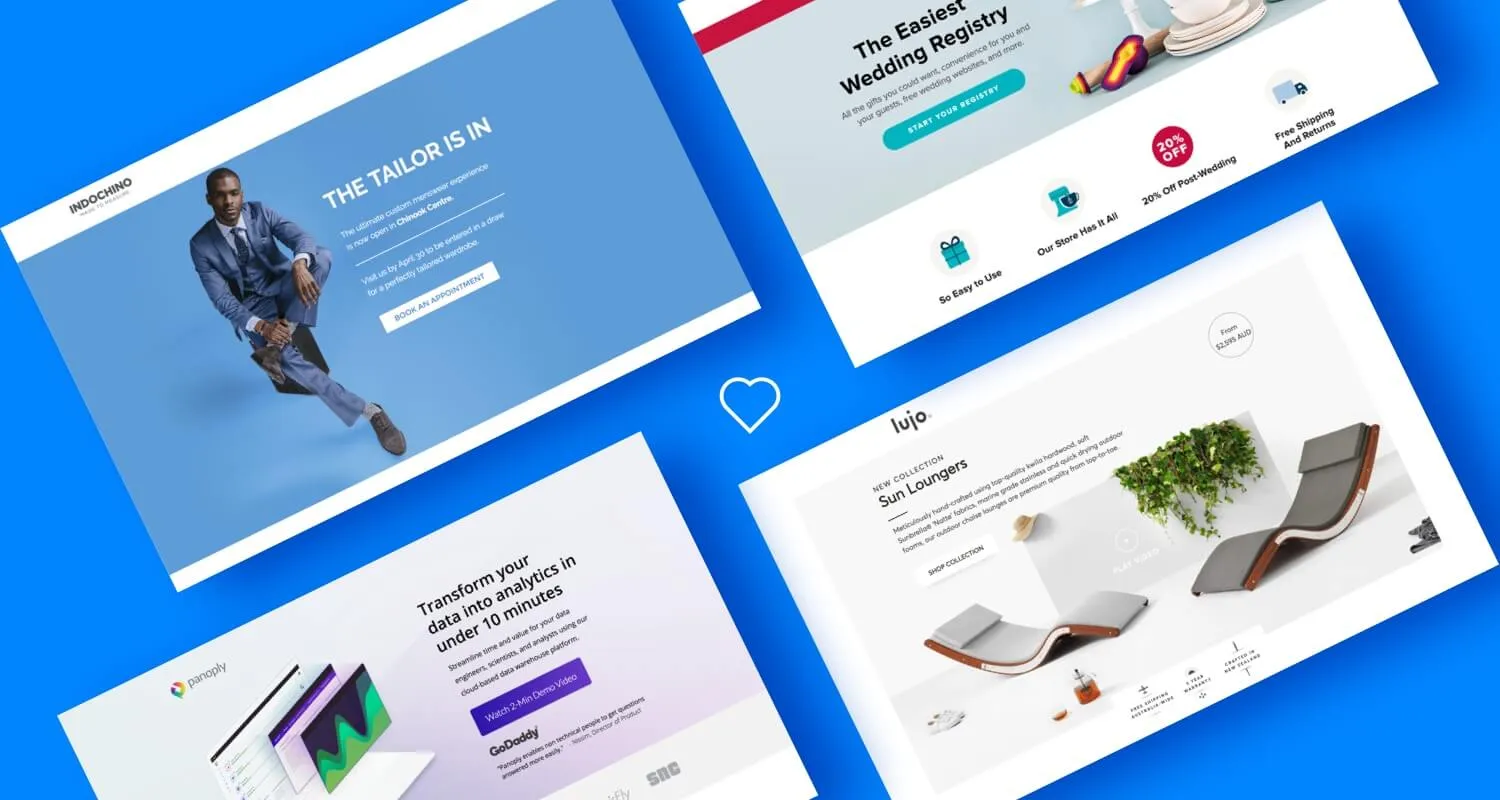
Source: ianfernando
How design influences user behavior and conversions?
The design of a landing page has a direct effect on how users will perceive your brand. Therefore, the design should be easy to use and quick to understand. Use a clean and intuitive layout with contrasting colors for CTA’s. Giving your landing page design a professional and polished look will engage users better, which will translate to more conversions.
The relationship between design and trustworthiness/credibility.
A professional design, having customer testimonials, trust badges, and high-quality visuals, give a credible look to your page. Try to add more of these elements to build trustworthiness. This will give confidence to users to share their information and make more purchases from your brand.
Statistics on conversion rates and the impact of good design.
According to HubSpot, companies with 30 or more landing pages generate 7 times more leads than those with less than 10. More leads mean more clicks, more engagement, and high conversions. Another statistical research states that a good landing page design can boost conversion rates by up to 200%.
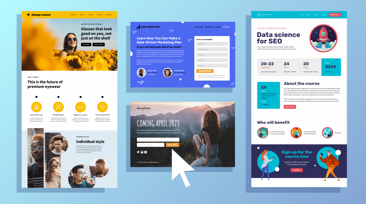
Key elements of a landing page design
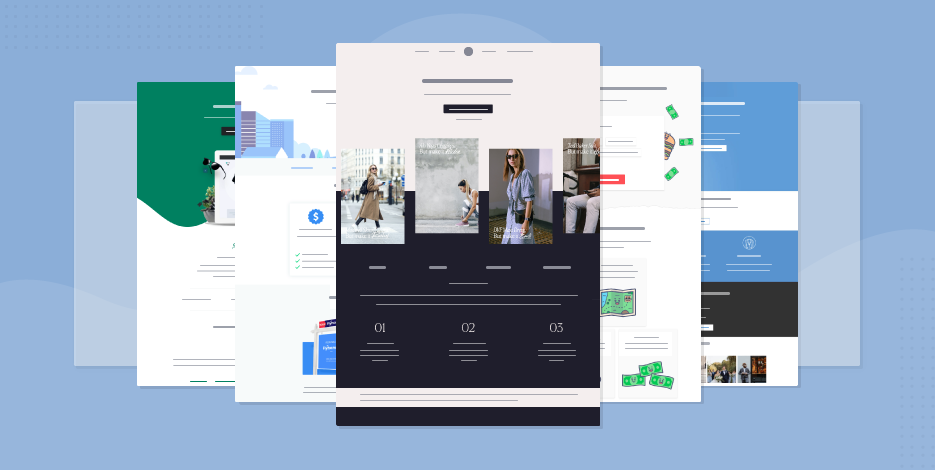
Source: moosend
Eye-catching and concise headlines
When a visitor reaches a landing page, a headline is the first thing they see. It is actually a ‘’hook’’ that can either catch or lose the visitor. Having a simple and catchy headline can engage them in the first few seconds of their landing on the page. Plus, it should also convey your message and unique selling proposition clearly.
Catchy visuals
Having eye-catching images and videos can persuade customers to follow the call to action. The right visuals can help to share your story, demonstrate your offerings, and connect with visitors on a personal level. Moreover, adding real-life and relevant pictures also helps customers to get a better understanding of what they are buying.
Concise description
Your landing page copy should be short and to the point. It should focus on explaining benefits to users and should be suggestive. One more thing, try to avoid jargon and use simple terms that are easily digestible by an average person. Having a concise and simple description will help you communicate clearly and persuasively.
Strong Calls-to-action
Call to action is a core component of a great landing page design. It acts as a main connecting point between your product and the user. Try to place the CTA button in a place where it is easily visible. Also, use phrases that are natural and actionable. It will motivate the users to avail your services with just one click.
3 Examples of Successful Landing Page Designs
Helena Rubinstein
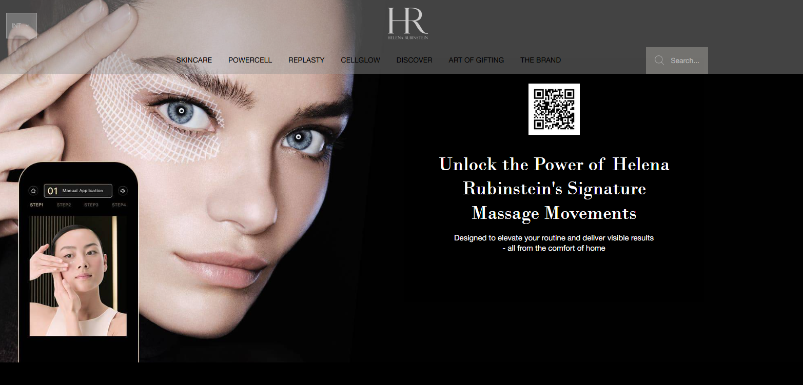
Source: helenarubinstein
The landing page of Helena Rubinstein, a leading luxury cosmetics brand, gives a fancy feel with a user-friendly layout. The page uses a lot of black space with large fonts and an understandable copy. The minimal and elegant design of the page lets users focus on key features.
It uses white color for copy, which gives it a classy and sleek look. Moreover, the page features high-quality pictures of models with glowing skin. Overall, the design of the landing page is clean and focused and guides the user straight to the point.
Huawei Nova
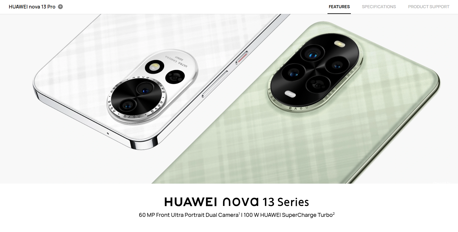
Source: Huawei
The landing page of the Huawei Nova 13 Pro gives a minimal, sleek, and clean look at first glance. It has big, eye-catching pictures of the phone showing its cool design like camera, body, and side buttons. The layout of the page is quite easy to follow and has clear sections.
Every feature is explained in a legible manner with high-quality images. It is free from unnecessary links and only has what users really need to know. The simplified design offers a clear conversion path and invites users to explore more.
Casa Loewe
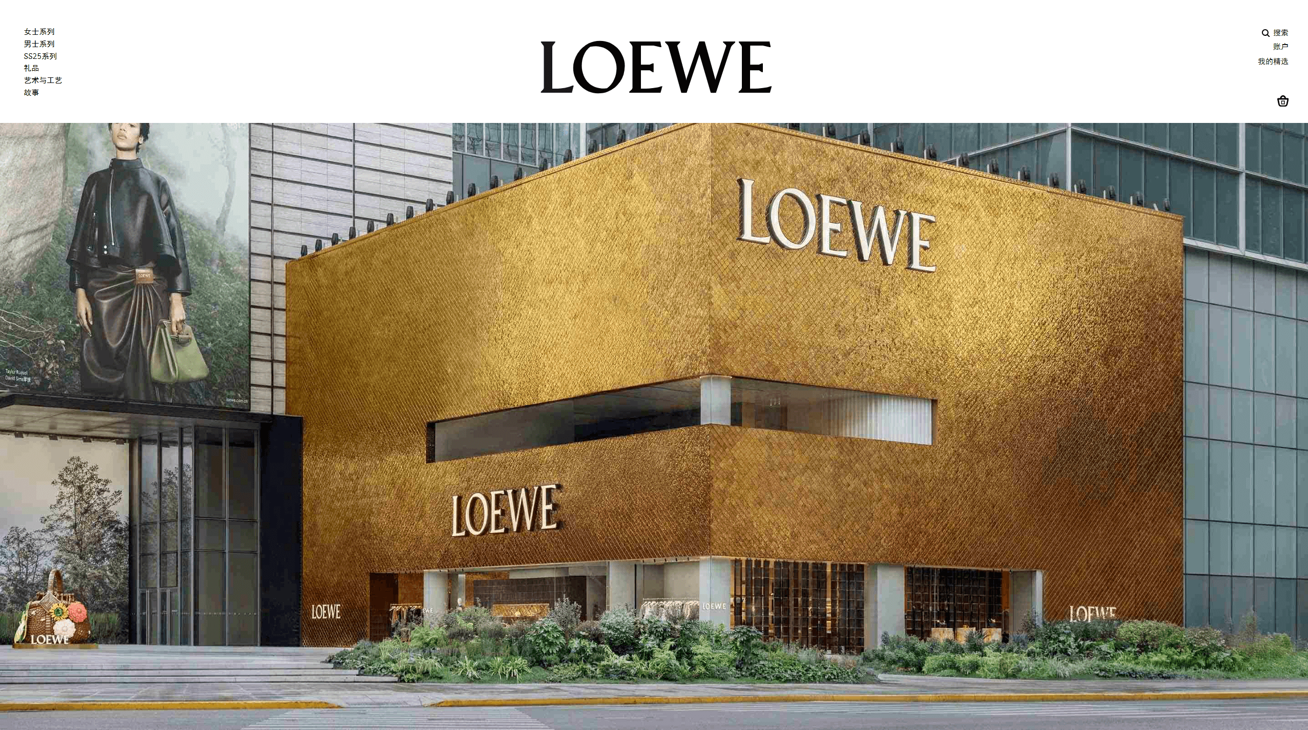
Source: loewe
The landing page of Casa Loewe clearly reflects the luxury vibe of the prestigious brand. It starts with a big and dynamic video of the flagship store located in Shanghai. The high-quality visuals show the iconic golden exterior of the store with shimmering gold ceramic tiles and interior sections very clearly.
The dynamic style of the page makes them feel like stepping inside the space from their screens. Every section has a simple layout and easy-to-read copy for users. The stylish yet artistic design of the page gives proper high-end vibes, just like Loewe itself.
Designing for user experience (UX)
Navigation and layout
The layout of a professional and engaging should be simple and clear. It will help the users navigate your page without any hassle. It should not include unneeded stuff that can distract the visitor from its goal. An easily scannable and scrollable landing page design can provide value and improve conversions easily.
A/B Testing
A/B testing a landing page provides useful insights. This can be helpful to make improvements in the layout of the page. An enhanced UX design can increase conversion rates by up to 400%.
Visual Hierarchy
Always maintain a visual hierarchy on your landing page. Use the right colors and placement to guide the eyes of the user to the most important parts of the page. Place headlines, subheadings, and CTA at suitable areas of the page to create a visual hierarchy.
Common Mistakes to Avoid in Landing Page Design
If you want to build a great landing page for your brand, keep some things in your mind. First, do not overload your page with the things that are not needed at all. Avoid using too many CTA’s or low-quality visuals. Keep your message concise and clear.
Also, keep in mind that about 56.89 % of web traffic comes from mobile devices. So, make sure the design of the page is responsive and it is mobile-friendly. Avoiding these mistakes will make your landing page more engaging. This will attract more users and boost overall conversion rates.
Create a Successful Landing Page with Kivisense
Landing pages are currently the most widely used marketing tools to gather leads. They are primarily about capturing and retaining visitors and turning them into customers and subscribers. If you want to create a compelling landing page design that converts highly, choose none other than Kivisense. We have designed and developed three successful, result-oriented, and high-converting landing pages for e-commerce brands. These thoughtfully curated landing pages have helped them get more impressions and leads with all-time high conversion rates. Contact us today and turn your visitors into customers.